Branding
Have you ever heard a founder say, "We've outgrown our brand," and then ask for a new logo?
I started xVS in 2014, and I still hear that a lot. The first half is often true. The second half is where companies burn money.
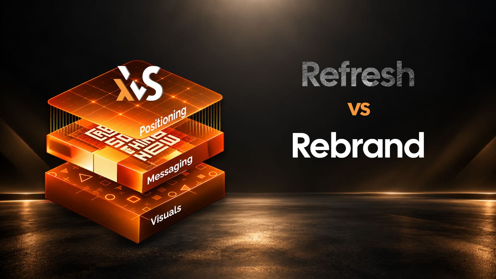
Short answer first. A rebrand changes your positioning: who you're for, what you replace and why you win. The name, logo and visuals change only if they no longer fit that position. A brand refresh keeps the positioning and updates how you look and sound.
And a surprising number of B2B companies need neither. They need one logo instead of four.
(Building a brand from scratch? Read A Logo Is Not a Brand instead. This guide is for brands that already exist.)
It comes down to where the change starts.
A brand refresh starts at the surface. You tighten the logo, update the colors and type, swap out tired photography, maybe sharpen the tone of voice. Your positioning stays put, and so do the things people recognize you by.
A rebrand starts underneath. Something in the business has changed (a new offer, a new buyer, a merger) and the old story no longer fits. You rework positioning and messaging first, and the identity follows.
Sometimes that includes the name.
Then there's the option most comparison charts leave out: neither. The brand itself is fine. The mess is in how it's managed.
Brand refresh | Rebrand | Neither | |
|---|---|---|---|
What changes | Logo details, colors, type, imagery, tone | Positioning, messaging, often the name and identity | Guidelines, templates, who approves what |
What stays | Positioning and recognizable assets | Only what you deliberately keep | Everything customers see |
Typical trigger | You look dated next to competitors | The offer, buyer or business changed | Off-brand decks, several logo versions |
Risk | Low | High: recognition can reset | Very low |
Example | Slack, 2019 | Dunkin', 2019 | A team with four logo files in circulation |
Slack is the textbook refresh. Its old logo was "11 different colors," and if it sat on anything but white or strayed from "the precisely prescribed 18º rotation," it "looked terrible," the company admitted in its 2019 announcement. Nothing about Slack's positioning changed. The logo was just painful to use.
Dunkin' went further. In 2019 it dropped "Donuts" from its name because the business was leaning hard into coffee and other drinks. That's a positioning shift, so it counts as a rebrand.
But it kept its familiar rounded font and the orange-and-pink color scheme it had used since 1973 (CBS News).
Even a real rebrand can keep the good stuff. Hold that thought.
A B2B team posted on r/branding recently with a problem I recognized instantly. They'd outgrown their brand. Several logos were floating around. The messaging didn't match from one channel to the next.
That's three different problems wearing one label.
Outgrowing a brand is a positioning issue. The pile of logos? Housekeeping. And messaging that shifts between LinkedIn and the sales deck is a words problem. Only the first one might call for a rebrand.
So when is a full rebrand worth it? When something real has changed in the business. These are the situations I'd take seriously:
What doesn't justify a rebrand? A new marketing lead who wants to leave a mark. A competitor's shiny new identity. Boredom.
You don't need an agency for this part. Pull up your homepage, your LinkedIn page, your last proposal and a recent sales deck. Then ask three questions, in order.
Ask three people (your head of sales, a project lead, a newer hire) to write it down in one sentence, separately. If the answers don't match, or your best customer wouldn't recognize any of them, you have a positioning problem.
That's rebrand territory. Start with repositioning, before anyone opens a design tool.
Read your homepage headline, your LinkedIn "About" section and the first paragraph of your proposal back to back. If the positioning is solid but the words drift, you have a messaging problem.
Fix it with a simple framework: one positioning line, three proof points, one voice. Keep the logo.
Put your website and deck next to your three closest competitors' and look hard. If you look a generation behind, or exactly like everyone else, it's a visual problem, and a refresh will handle it. (For a benchmark, see the craft signals that make a website read as premium.)
If you pass all three, you probably need neither. You need brand rules: one master logo file, one template library and one person with the authority to say no.
That last part matters. Since 2016, xVS has handled event branding for the Confederation of Indian Industry (CII), and each event needs a website, digital creatives and small- and large-format print.
The agenda has to rea d the same on a stage backdrop as it does on a phone. That kind of consistency comes from process: one team, one system, one set of files.
Dunkin' was smart to hold on to its orange and pink. Cracker Barrel shows what happens when a brand lets go of the wrong thing.
In August 2025, Cracker Barrel unveiled a new logo without the barrel, without the words "Old Country Store" and without the "Old Timer," the man leaning on the barrel. Its shares fell more than 7% that Thursday, the AP reported. About a week later the company reversed course: "Our new logo is going away and our 'Old Timer' will remain" (ABC News).
Tropicana made the same mistake in 2009. It replaced the orange-with-a-straw on its cartons with a plain glass of juice. Sales fell 20%, about $30 million, and the old design was back within six weeks, according to CNN.
Those are consumer brands. Does any of this apply in B2B?
More than you'd think. Professor John Dawes of the Ehrenberg-Bass Institute estimates that only about 5% of your target customers are actively looking to buy at any given time. The other 95% will buy later, and when they do, they'll start with the names they remember.
Your colors, your mark, even a slightly odd name are memory hooks. Rip them out and you're asking future buyers to learn you from scratch.
Mailchimp shows the smarter path. Its 2018 rebrand with the studio Collins brought a new wordmark, a new typeface and a bold "Cavendish Yellow," and Freddie, the winking chimp, stayed (Creative Review).
Before any redesign, list every asset that might live in a customer's head: colors, shapes, characters, taglines, even the sound at the end of your videos. Then ask five or six real customers what they remember about you, unprompted.
Whatever they name, protect it.
If your diagnosis says rebrand, the order of the work matters more than the size of the budget. Use this as your rebrand checklist:
We followed that order with Anandam Narain Roller Flour Mills, where the job was much bigger than a logo. We developed a new name, logo and identity to strengthen the company's market presence, then carried that system onto packaging for its flours and byproducts.
Gecko Monaco is another. Everything flowed from its premium positioning: the logo first, then the full identity, then the website. You'll find both in our branding work.
If the website is part of the rebrand, keep it lean. Overbuilt websites often convert worse, and a rebrand is a bad moment to add complexity.
Plenty of companies that ask for a rebrand don't need one. The ones that do can't skip the positioning work, because a new logo on an old story fixes nothing.
So diagnose first. If your positioning still holds, refresh the look and the words and get back to selling. If it doesn't, rebuild from the positioning outward, and protect what people already remember, the way Dunkin' kept its orange and pink and Mailchimp kept Freddie.
One final tip: before you brief any agency (us included), write the one sentence you'd want a buyer to repeat about your company. If you can't write it yet, you're not ready to design. And if you're still choosing a partner, judge agencies by the questions they ask.
A refresh updates how your brand looks and sounds and keeps your positioning. A rebrand changes the positioning itself, and the identity changes to match.
It depends on scope. Refreshing a logo, colors and templates costs far less than a full rebrand with positioning work, naming, a new identity system and a website. At xVS, a refresh typically runs $2500 - $5000 and a full rebrand $10,000 - $12,500.
At xVS, a refresh usually takes [3-4 weeks] and a full rebrand [2-3 months]. Plan extra time for rollout, since every template, profile and sales asset has to change.
Usually because something in the business changed: what they sell, who they sell to, a merger or acquisition, or a name that no longer fits. Wanting a fresh look on its own is a reason to refresh, not to rebrand.
It can if you change domains or URLs carelessly. Keep URLs where you can, and use permanent (301) redirects for any that change, as Google recommends for site moves. Update your business profiles at the same time. If AI assistants already cite you, keep your new pages easy for them to quote.
Not always. Dunkin' changed its name and kept its font and colors. A logo is one layer of a brand, and rarely the layer that's broken.
Tell us what's changed in your business and send over your homepage, a recent deck and your logo files. We'll tell you whether it looks like a rebrand, a refresh or neither, and we're happy to say neither. Start the conversation, or browse our services first.
About the author: Vinay Sharma is the Founder and Chief Design Officer of xVS Creations, the design studio he started in 2014.