Website Development
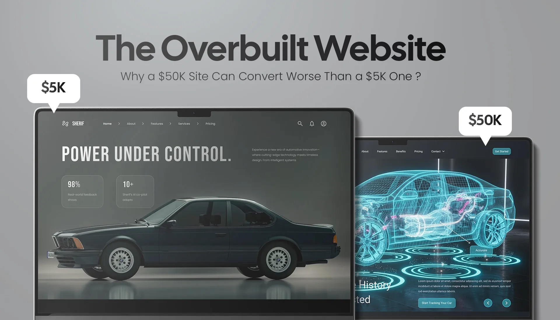
A founder we spoke with last year had just spent close to $50,000 on a website. Custom everything. Scroll animations that genuinely made people say “whoa.” A headless setup, a bespoke CMS, a hero video that took three weeks to color-grade.
It converted worse than the $6,000 site it replaced.
That’s not a freak accident, and it’s not an argument for cheap work. Here’s the uncomfortable truth we’ve watched play out for more than a decade of building and rebuilding sites: a website’s price and its conversion rate are only loosely related. Most sites that don’t convert didn’t fail because nobody spent enough. They failed on strategy, not budget — and a bigger budget often makes the strategy problem worse, because it buys more things to hide behind.
If your expensive website isn’t pulling its weight, this is for you. We’ll show you what “overbuilt” actually looks like, why simpler and faster usually wins, and how to spend so the money lands where conversions are actually decided.
Short answer: yes, and it happens more than agencies like to admit.
Price buys craft, scope, and polish. It does not buy clarity, focus, or speed — and those three are what move a visitor from “just looking” to “talked to sales.” You can spend $50K and end up with a slower, busier, more confusing site than a focused $5K build, because most of that money went into things the visitor never asked for and the conversion never needed.
Think about what a bigger budget typically adds: more pages, more animation, more custom interactions, more imagery, heavier frameworks. Every one of those is weight. And weight is the enemy of the two things conversion depends on most — how fast the page loads and how quickly a human can figure out what to do next.
Here’s the same project framed two ways:
The focused $5K build | The overbuilt $50K build | |
|---|---|---|
Body | One: get qualified leads to inquire | “Everything” — brand, portfolio, blog, animations, micro-interactions |
Pages | 4–6, each with one job | 20+, many with no clear job |
Load time | Fast (lean code, few elements) | Slow (heavy framework, video, scripts) |
Primary action | One obvious CTA, repeated | Five CTAs competing for attention |
Built for | The business as it is today | An imagined business three sizes bigger |
Typical outcome | Converts | Impresses, then leaks visitors |
The expensive site usually wins the “wow.” The focused site usually wins the lead. If you’re choosing where to put your money, that trade matters — and it’s the whole reason we build the way we do across our web and app work.
When a site underperforms, the instinct is to assume it wasn’t finished enough — needs more design, more features, another redesign. Usually, the opposite is true. In our experience the cost balloons and the conversions sink for three connected reasons. None of them are about spending too little.

This is the silent budget-killer. When a project starts without a sharp answer to who is this for, what one action do we want, and how will we know it worked, the team builds toward a moving target. A direction gets chosen, built, and then — because it was never really decided — it gets second-guessed and rebuilt.
You don’t get billed for “indecision.” You get billed for the rework it causes. Three rounds of “actually, can we try…” is three rounds of design and development time, and at agency rates that’s where a $15K project quietly becomes a $50K one. The site that emerges isn’t better for the detours; it’s a patchwork of half-committed directions, which users feel even if they can’t name it.
Clarity is the cheapest performance upgrade you can buy, and it costs nothing but the discipline to decide before you build. (More on how to force that clarity below.)
Not every problem needs a heavy solution. A brochure site for a services business does not need a headless architecture, a custom CMS, or a single-page-app framework — but those get specced anyway, because they sound robust and because complexity is easy to sell.
A dynamic, database-driven build isn’t automatically better than a simple one; it’s just heavier, slower to load, more expensive to maintain, and more things that can break. Choosing it when a lean static site would convert better is the web equivalent of buying a cement mixer to frost a cupcake. The skill isn’t in using the most powerful tool. It’s in knowing the least complex approach that still gets the result — which is exactly the judgment call a good UI/UX and product team is supposed to make for you.
Overbuilding is often optimism in disguise. You specify the site for the business you’ll be in three years — the huge catalogue, the membership portal, the multi-language rollout — and you pay, today, to carry all that scaffolding while you’re still proving the basics.
The cost isn’t only money. It's the focus. A site straining to do twelve jobs does none of them sharply, and visitors arriving for one thing have to wade through eleven others to find it. Build for the stage you’re actually at. You can always add the portal when you have the members to fill it.
“Overbuilt” sounds abstract until you’re staring at one. Here’s the checklist we run when a client’s gorgeous, expensive site isn’t converting. If you recognize three or more, the problem probably isn’t that you spent too little.
This is where the “less is more” claim stops being a designer’s taste and starts being measurable. The evidence is genuinely one-sided, and most of it traces back to two things overbuilt sites are bad at: speed and focus.
Page weight is the most direct line from “overbuilt” to “underperforming,” and the data is brutal.
In Google and SOASTA’s analysis of millions of mobile pages, as a page grew from 400 elements to 6,000, the probability of conversion dropped by 95%. Element count is almost a definition of “overbuilt” — every extra animation, widget, and script is another element — and it maps almost perfectly onto lost conversions.
Load time tells the same story. Akamai found that a 100-millisecond delay can cut conversion rates by 7%, and a two-second delay more than doubles bounce rates. Google’s “Milliseconds Make Millions” study with Deloitte found that a mere 0.1-second improvement in mobile load time lifted retail conversions 8.4% — and pushed lead-generation form completions up by 21.6%. Independent analysis by Portent found sites loading in one second convert up to three times better than sites that take five.
The overbuilt $50K site is frequently the slower one. That’s not bad luck. It’s the bill for all that weight, paid in lost customers.
A page that asks for one thing gets that thing more often. This is partly about clarity and partly about how decisions work — every extra choice you put in front of someone is another reason to stall.
The famous “jam study” by Iyengar and Lepper found shoppers were far more likely to buy when shown 6 options than 24. We’ll be honest about this one, because honesty is the point: a later meta-analysis of 50 experiments found the average “choice overload” effect is close to zero — sometimes more options hurt, sometimes they don’t. So the rule isn’t “always strip choices.” It’s sharper than that: reduce choices that are redundant or hard to tell apart. Five CTAs that compete for the same click are exactly that kind of confusing redundancy — and that’s the kind an overbuilt homepage tends to pile on.
Fewer form fields follow the same logic. The average checkout carries 11.3 fields when about 8 would do, and every needless field is friction between a willing buyer and “done.”
There’s a credibility layer too. People decide how they feel about a page almost instantly — Google-backed research found visitors form a first impression in under 50 milliseconds, and they consistently rate visually complex sites as less appealing and less trustworthy than simpler, more familiar ones. Stanford’s long-running web-credibility work found that nearly half of people judge a company’s credibility partly on visual design — and “simple and clear” beats “busy and impressive” on trust almost every time.
None of this means ugly or barebones. Clean, fast, and focused takes real craft — arguably more than throwing every effect at the wall. It’s just craft pointed at the result instead of the showreel. You can see what that looks like across our work.
This is where a lot of overspending starts, so it deserves a straight answer: most businesses need a custom design, not necessarily custom development. A well-built site on a mature platform, designed properly, will out-convert a from-scratch custom build that blew its budget before it got to strategy.
Use this to decide honestly:

The point isn’t “templates good, custom bad.” It’s that the approach should be chosen for your situation, not for what sounds most impressive in a proposal. Picking the right level of build is a strategy decision, and it’s the first thing we pressure-test in any web project.
Enough to get strategy, clarity, and speed right — and not much more until you’ve proven the basics work.
Ballpark, US ranges look roughly like: DIY builders run $20–50/month; a capable freelancer, $1,500–$5,000; a boutique agency build, $6,000–$15,000; and a full custom agency project, $15,000–$40,000+ depending on scope. Those tiers are real, but notice what actually decides conversion sits underneath all of them: did you get the positioning, the single clear action, and the load speed right? You can nail all three at $6K and miss all three at $60K.
Our advice to founders is consistent and a little against our own short-term interest: spend on clarity first. Put real money into figuring out who the site is for and what it must do, get that built simply and fast, then reinvest in complexity only where the data says it’ll pay. That sequencing is the entire difference between a site that earns its cost and one that just was costly.
Because unclear direction is the number-one budget-killer, the cheapest thing you can do before spending a dollar is write a one-page brief that forces decisions. Answer these, in writing, before anyone designs anything:
Question 5 is the one that saves you $40K. Every “wouldn’t it be cool if…” you park there is rework you don’t pay for and weight your visitors don’t carry. A site built from a brief like this tends to be smaller, faster, clearer — and it converts, which was the whole point. If you’d like a second pair of eyes on yours, that’s literally what we do; start a conversation here.
Looks and conversions are different jobs. A site can be beautiful and still be slow, unfocused, or unclear about what it wants visitors to do — and those are the things that actually drive action. Most non-converting sites have a strategy gap (no single clear goal, weak positioning, too much friction), not a design-quality gap.
It can be — if that budget buys clarity, speed, and the right level of build for your stage. It’s not worth it if it buys complexity your business doesn’t need yet. Plenty of $50K sites convert worse than focused $5K ones because the money went into polish and features instead of strategy and performance.
Usually, yes — because simple sites tend to load faster and present one clear action, and both strongly correlate with higher conversion. Page speed and focus are two of the most reliable conversion levers there are. “Simple” should mean clear and fast, not unfinished.
Most businesses need custom design on a solid platform, not custom development. Go custom-build only when you have genuinely unusual functionality, a team to maintain it, and the budget to do strategy properly first. For typical marketing-and-lead-capture sites, a well-designed template-based build is faster, cheaper, and converts just as well.
Enough to get positioning, a single clear call to action, and fast load times right — often $5,000–$15,000 with a good freelancer or boutique agency. Spend on clarity first; add complexity only when your numbers justify it.
Almost always because the direction wasn’t decided before the building started. Unclear briefs cause rework, and rework — not the original scope — is where the budget disappears. A sharp one-page brief upfront is the best cost control there is.
Most sites that don’t convert weren’t underfunded — they were unfocused. If yours is getting traffic but not leads, we’ll tell you straight whether it’s a strategy fix or a rebuild. Book a free conversion audit with the xVS Creations team.