Web Design, UI/UX, Branding
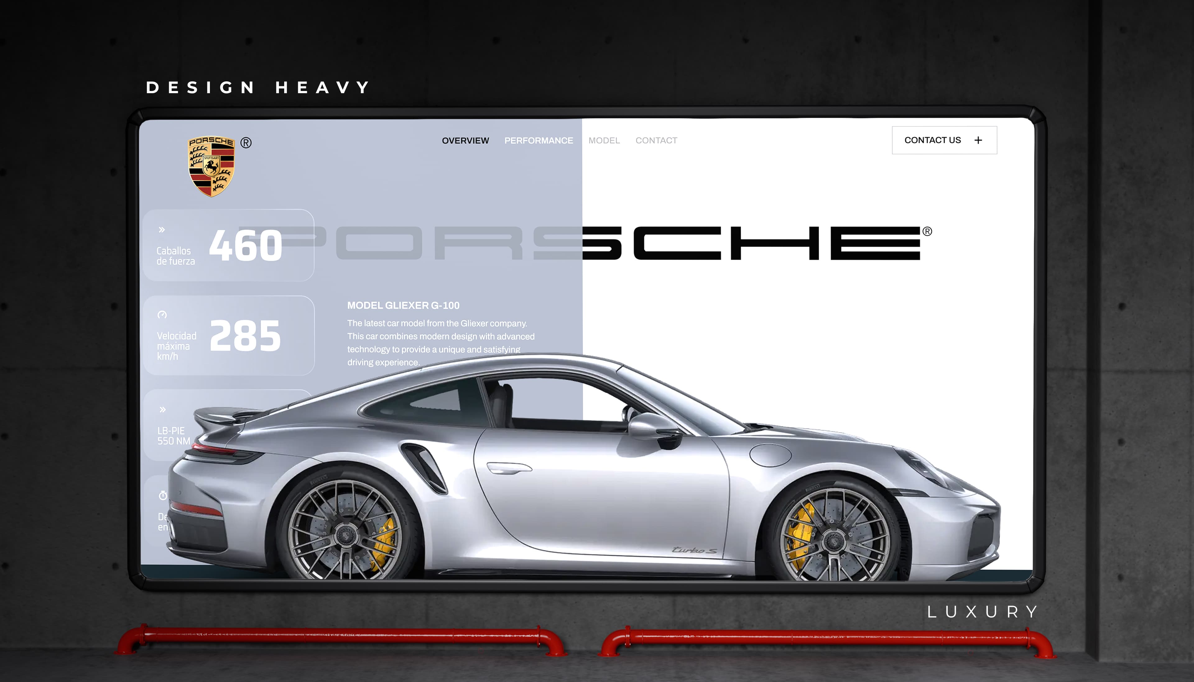
You’ve felt this. You land on a website and, in about a second, before you’ve read a single word, some part of your brain has already decided: these people look legit, or this looks a bit cheap.
You weren’t being shallow. You were reading craft signals. The same ones I read all day.
And here’s the good news buried in that. Looking premium isn’t about spending a fortune or hiring a famous studio. It’s a handful of specific, learnable moves. Get them right and a small budget can look expensive. Get them wrong and a huge budget still looks like a template somebody bought on a Tuesday.
That snap judgment is real, and it’s fast. Stanford researchers found that 46% of people judge a company’s credibility on its design. Other research clocked that first visual impression at roughly 50 milliseconds. Fifty. You don’t get a second go at it.
So let’s rank the signals that actually move the needle, heaviest first, and name the cheap tell that gives each one away. I’ll lean on Apple, because it’s the clearest example there is, and I’ll be honest about what we aim for on our own site too.
If you take one thing from this piece, take this. The fastest way to look premium is to put less on the screen.
I know how wrong that feels. You paid for the website. Surely it should show everything, right there, above the fold. Every service, every client logo, three testimonials, a chat bubble, a newsletter popup, a banner about the sale. That instinct, the urge to cram, is the single most common reason sites look cheap.
Premium design does the opposite. It picks the one thing that matters on a given screen and gives it room to breathe. Open any Apple product page and look at how much of it is simply empty. One product. One line. A lot of quiet around it. That space isn’t the designer running out of ideas. It’s confidence. It says, this is worth looking at, so look. Google’s own research points the same way: people consistently prefer simpler, cleaner designs, and judge them as more appealing.
That’s the heart of it, and honestly it’s the thing we care about most in our own work: a limited amount of content, laid out so the important things have space to stand out and actually earn your attention. It’s what we’re always chasing on our own site, and what you’ll see running through our work.
The cheap tell is the opposite of all that. A page so full your eyes have nowhere to rest. Six things shouting at the same volume, so you hear none of them. If your homepage feels busy, you don’t have a content problem. You have a nerve problem. Cut half of it. Then look again and cut a little more. (We wrote a whole piece on this, on why an expensive, overbuilt site can convert worse than a lean one.)
Color is the second big lever, and it’s one of the cheapest to fix.
Here’s the mistake I see constantly. A brand picks a color it likes, then a second, then a third for the buttons, then a fourth because the founder saw it somewhere, and pretty soon the page looks like a bag of candy. Nothing clashes on purpose, but nothing agrees either. That disagreement is what your eye reads as “amateur,” even if it can’t say why.
Expensive-looking sites are disciplined here. Usually one calm base, lots of neutral, and one or maybe two accent colors are used sparingly, always for the same job. That restraint is what our founder means by color symmetry: the whole palette feels like it belongs to one family, so the eye relaxes and trusts it.
You don’t need a fancy palette. You need a small one that agrees. Three colors that get along beat eight that merely tolerate each other, every single time.
If color is cheap to fix, type is nearly free, and it might do more for the “premium” feel than anything else on this list.
Good typography is quiet craft. A single well-chosen typeface. Generous size, so nobody squints. Line spacing that lets the words breathe instead of stacking on top of each other. Get those three right and plain text starts to feel considered, even luxurious. Fonts add a richness to the whole experience that people feel without ever noticing the font.
The cheap calls here are loud once you know them. A default system font doing all the work. Two, three, four typefaces fighting for attention. The body text set is so small and tight it’s a chore to read. Fix the type and you often fix “it looks cheap” without touching anything else on the page.
This is where a lot of people reach for premium and grab the opposite.
Done well, motion is gorgeous. A menu that eases open. A subtle shift when you hover. A page that transitions instead of snapping. It’s a big part of why an Apple page feels expensive, and it’s what our founder points to about Apple specifically: the animation is smooth, and it always serves the content rather than showing off.
Now the trap. Motion that stutters, motion that’s everywhere, elements that fly in from six directions and bounce for no reason. Janky animation doesn’t read as effort. It reads as cheaper than a completely still page. So the rule is simple. If you can’t make it smooth and purposeful, don’t make it move.
Premium isn’t only how a site looks. It’s how sure of itself it feels.
The other thing our founder admires about Apple is how clear it is. You always know what you’re looking at and where to go next. That certainty reads as expensive, because confusion never does. A cluttered menu, a wall of text with no shape, three buttons that all seem equally important, a homepage that never says what the company actually does, that’s the feeling of a site that isn’t sure of itself. And uncertainty looks cheap on anyone.
Clarity is a design decision, not a copywriting afterthought, and it’s the core of good UI/UX design. One obvious next step per screen. A menu a stranger can read in a glance. Say what you do in plain words, up high, before anything clever.
The last signals are small on their own and brutal in a pile.
The stock photo of four people laughing at a laptop. The logo that goes slightly blurry when it scales. A hero image that’s a different mood from the one below it. Any single one is survivable. Together they whisper “template,” and people hear it. Real, consistent imagery, even a few honest photos of your actual work, beats generic stock almost every time.
And speed belongs here too, because premium has a feel as well as a look, and the feel is smooth. A site that hitches while it loads, or lurches as images pop in late, breaks the spell no matter how nice the design is. Fast and steady is part of looking expensive. Cheap-feeling and slow tend to arrive together.
Notice what’s missing from this list. Not one of these signals is “spend more money.” Restraint is free. A smaller color palette is free. The better type is nearly free. Smoother motion, clearer navigation, honest images, a site that doesn’t lag, none of it is about budget. It’s about care, and about the confidence to leave things out.
That’s the real secret. Cheap-looking sites try to show you everything. Expensive-looking sites choose one thing and trust it. Trusting is the hard part, and it’s the whole game.
One last tip for your own site. Open your homepage, and instead of asking “what could I add,” ask “what could I remove.” Keep pulling things off until it feels slightly too empty. That’s usually the exact moment it starts to look premium.
Mostly restraint and craft, not budget. Generous space around a few important things, a small palette of colors that agree, one good typeface used at a comfortable size, smooth and subtle motion, obvious navigation, and real high-quality images. Do those well and even a low-cost site reads as premium.
Usually because it’s trying to show too much at once, uses too many colors or fonts, leans on generic stock photos, or animates in a janky way. The budget doesn’t fix those. Cutting clutter, tightening the palette, improving the type, and speeding up the site almost always do.
Yes. People judge credibility partly on design within the first fraction of a second, and a site that reads as cheap loses trust before anyone reads a word. Looking considered and trustworthy is not vanity; it’s the first thing that decides whether a visitor stays.
Remove things and add space. Take clutter off the homepage until the most important element clearly stands out. It costs nothing, and it moves the needle more than any new color, font, or effect you could add.
No. One well-chosen typeface, sized and spaced with care, looks premium even if it’s free. A handful of real, consistent photos of your actual work usually beats expensive-looking stock. Consistency and restraint read as a premium far more than price does.
Want to see restraint, color, and type working together in practice? Have a look at our work, see how we work, or start a conversation if you’d like your site to read as premium as your business actually is.