UI/UX, Web Design
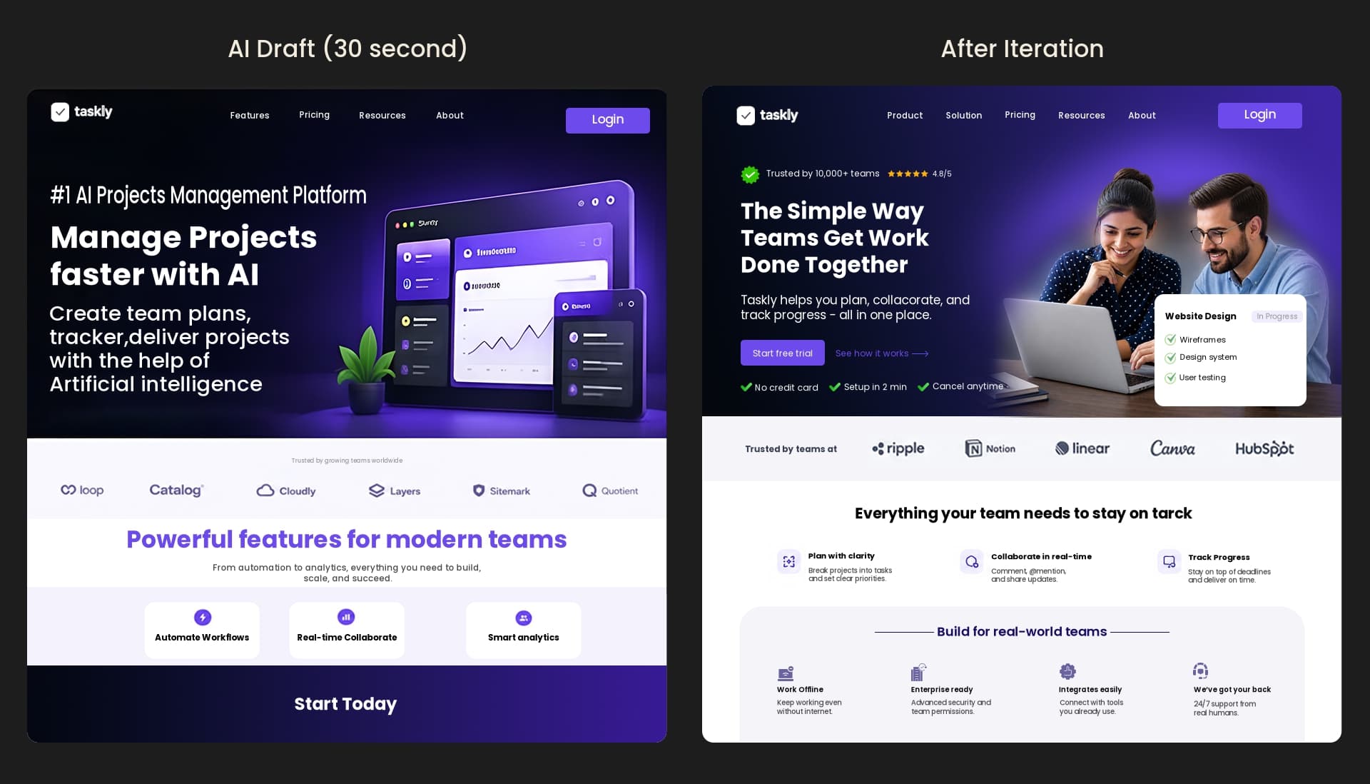
You can generate a full landing page in about thirty seconds now. Type a sentence into a tool, and out comes a hero, a headline, three feature cards, a button. It looks done. It looks, honestly, pretty good.
Ship it, though, and it usually underperforms. Not because AI is bad. Because what it handed you isn’t finished. It’s a draft.
That’s the whole idea here, so let me say it plainly: AI gives you a draft, not a design. The two look nearly identical on screen, which is exactly the trap. The difference isn’t in the pixels you can see. It’s in the work that hasn’t happened yet.
And we use AI every day at xVS Creations, so this isn’t a designer grumbling about robots. It’s just what the tools have taught us on real projects. The first version is the easy part. The design is the part after, and for now, that part is still yours.
Let’s not pretend these tools are useless. They aren’t, and anyone who says so hasn’t used them lately.
At our studio, AI does two honest jobs. It turns a rough idea into a visual draft fast, so instead of describing a concept in a meeting we can put something on screen and actually argue about it. And it takes the slow, boring tasks off our hands. Cutting the background out of an image used to be a fiddly ten-minute chore. Now it’s a click. We use ChatGPT to sketch directions and Magnific to sharpen and upscale imagery. Real work, genuinely faster.
That’s the honest case for AI in design, and it’s a strong one. It kills the blank page. It clears the grunt work. If you’re a founder, using it to stand up a first draft is a smart, cheap move.
Just don’t mistake that draft for the finished thing. Which is where the trouble starts.
A draft is a plausible first guess. A design is a stack of decisions made on purpose, for a specific customer, checked against reality.
Prompt a tool like v0 or Figma’s AI for a pricing page and it gives you a pricing page. A real one, shaped like every good pricing page it has ever seen. There’s the catch, hiding in plain sight. It’s shaped like every other one. It doesn’t know your pricing confuses people, or that your best customers hesitate at the annual plan, or that the one thing you most need to explain is the thing the template leaves out. It can’t know. You never told it, and it never asked.
A design begins where the draft stops. It asks who this is really for, what they’re scared of, what they need to see before they’ll act. Then it gets those answers wrong, and fixes them, and gets them a little less wrong. That back-and-forth isn’t a detour around the process. It is the process.
There’s a simple reason AI output carries that faint “seen it before” flavor, and it isn’t a defect.
These tools learn from enormous piles of existing work and then produce the most likely next thing. The most likely thing is, by definition, the average thing. So you get the purple gradient. The same three-column feature grid. A hero sentence that could belong to any company in any industry. Competent, familiar, forgettable.
Familiarity isn’t automatically bad, to be fair. Google’s own research found people genuinely prefer simple, familiar designs. But there’s a line between familiar and generic, and un-iterated AI output tends to sail right past it. People clock it, too. Around 46% of people judge a company’s credibility on its design, according to Stanford, and “looks like a template” is a rough way to spend that first second. It’s the same reason restraint and craft matter so much, the stuff we got into in what makes a website look premium.
Here’s the number that should settle it.
Nielsen Norman Group measured what iteration does to a design across a set of case studies. From the first version to the last, usability improved by a median of 165%. Each round added a median of 38%. Their advice: go through at least three versions before you call it finished.
Now read that with AI in mind. The generator hands you version one. Only version one. That 165% lives in the versions it never made, the rounds where a real person tries to use the thing, gets stuck, and you fix the precise spot they got stuck. That loop, test, learn, change, repeat, is how a draft slowly becomes a design. And it’s the part no current AI can run for you, because it means watching your actual customers, not the internet’s average one. It’s most of what we do in our UI/UX process.
Apple is the easy picture of the far end of that loop. Nobody thinks an Apple product page fell out of a generator. It feels considered because it was, over and over. That “considered” feeling is just iteration you can see, and it’s what we chase across our work.
So the takeaway isn’t “avoid AI.” We just told you we use it. It’s to put AI in the right seat.
Use it to reach version one fast. Let it kill the blank page, rough out the layout, handle the background removal and the upscaling and the busywork. Then take every hour it just saved you and pour it into the place design actually happens: in front of real users, watching what trips them up, reworking it. Round two. Round three. The generator got you to the starting line quicker, which is great. Now you still have to run the race.
The founders who get burned are the ones who mistake the starting line for the finish. They ship version one because it looked finished, skip the only step that was ever going to make it work, and then wonder why a good-looking site doesn’t convert.
Once you know the tells, you can’t unsee them. On your own site, or on an agency’s mockup, watch for these.
A hero line that would fit any company on earth. Default components, dropped in untouched. Every section shouting at the same volume, because nothing got prioritized. Copy that lists features but never names the specific worry your customer actually has. And the giveaway: ask “what did you change after you tested this?” A blank look means you’re looking at a draft that got promoted to a design without earning it.
None of this means “made with AI” is bad. It means nobody did the design part afterward. Those are two very different problems, and only one of them costs you customers.
AI has genuinely changed how design starts. It’s faster, the blank page is gone, the boring parts are getting automated, and all of that is good. What it hasn’t changed is where quality comes from. Quality still comes from decisions made for real people and corrected by real feedback, one round at a time.
So take the AI output for what it honestly is. Not the answer. A very fast first guess at the answer. The design is what you do next.
One last tip. Next time a tool hands you a screen in thirty seconds and it looks finished, don’t ship it. Put it in front of five real users and watch where they hesitate. Every pause is a spot where the draft was hiding a problem, and fixing those is the moment it turns into a design.
AI can draft one, fast. It generates a competent first version from patterns it has seen. But a draft isn’t a finished design. It hasn’t been shaped around your specific customers or tested with real users, and that’s where usability and conversions actually come from. Use AI for the draft, then iterate toward the design.
Because they’re built from the average of existing work. AI predicts the most likely next element, and the most likely thing is the common thing, so you get familiar layouts and interchangeable copy. That’s fine as a starting point. It only reads as generic when nobody refines it for a specific audience.
For a rough draft, maybe not. For a site that has to convert, yes. The value lives in the iteration: testing, prioritizing, and fixing what real users struggle with. AI produces version one; human judgment is what turns version one into something that works.
Killing the blank page and clearing busywork. It’s excellent at turning an idea into a visual draft you can react to, and at slow tasks like background removal or image upscaling. We use it for exactly that. The trick is using it to start faster, not to skip the design work that comes after.
Stop treating the first output as final. Give it a specific audience, rewrite the copy around your customer’s real worry, cut whatever doesn’t earn its place, and test it on actual users. That refinement is what removes the template feeling. The refinement is the design.
Want your site designed, not just generated? Take a look at how we work and the iteration behind our UI/UX projects, or start a conversation about yours.