Branding

Have you ever heard a founder say, “I just need a logo”?
I hear it constantly. Someone starts a business, gets excited, and the first thing they do is open a logo maker or ask a designer for a logo, and nothing else.
I get the urge. A logo feels real. You can see it, put it on a business card, and show it to your friends. But here’s the catch: a logo is not a brand. It’s not even close.
Your logo is one small piece of your brand, the part everyone can see. Your brand is everything underneath it: what you stand for, who you’re for, how you sound, and whether people trust you enough to buy. Get the logo without the rest, and you’ve got a nice picture attached to nothing.
The good news? Building a real brand isn’t hard once you know the order to do it in. In this article, I’ll walk you through the brand-identity stack we use at xVS Creations, the order that actually works, plus the two most expensive mistakes I see founders make.
No, and the difference matters more than most people realize.
A logo is a mark that helps people recognize you. A brand is the whole impression they carry around about your business: your promise, your personality, and whether they trust you.
Take Nike. The swoosh cost just $35 back in 1971. Did that little checkmark build a global empire? Of course not. Everything Nike put behind it did, from the athletes to “Just Do It” to decades of storytelling. The swoosh got famous because the brand did, not the other way around.
And people judge you fast. Stanford researchers found that 46% of people judge a company’s credibility on its design, and they form that first impression in around 50 milliseconds. So yes, looks matter. But looks get you noticed, not chosen. Trust gets you chosen, and 81% of people say they have to trust a brand before they’ll buy from it (Edelman). A logo can’t earn that trust. The rest of your brand has to.
Because the logo is the part you can see. You can print it, post it, and feel like you’ve launched something. Strategy feels like homework, so it gets skipped, and the logo ends up carrying meaning nobody gave it.
Remember when Gap changed its logo in 2010? The company swapped its classic blue box for a plain new design almost overnight. Customers hated it, and within about a week Gap quietly put the old logo back. That’s what happens when you change the visible part without a strategy behind it: you spend money, annoy people, and end up right back where you started.
Building the logo first is like picking your paint color before anyone has drawn the floor plan. You can do it. It just tells you nothing about whether the house will stand up.
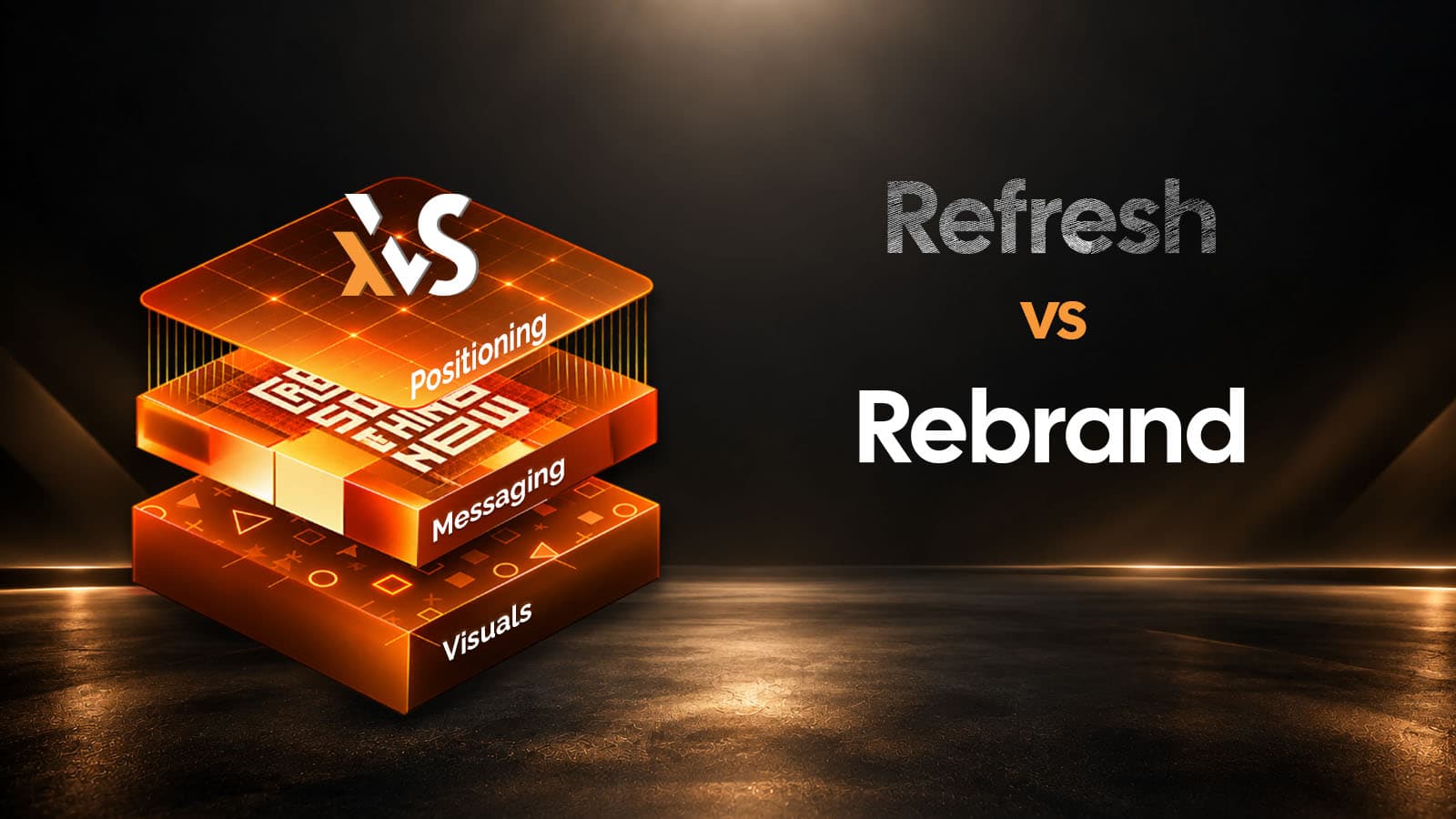
A brand gets built in layers, from the ground up. Each layer supports the next, and the logo sits on top as the last thing you make. Here’s the order we follow on every branding project.

Build in this order and the logo almost designs itself, because every choice has a reason behind it.
Here’s the second mistake, and it’s the one careful people fall into. They treat the brand as something to finish before launch. Months of debate, a dozen logo rounds, a 60-page guideline nobody will read, all before a single customer has seen a thing.
In my experience, that’s just as costly as rushing, because you lose time you can’t get back. The best feedback doesn’t come from a meeting room. It comes from real customers reacting to real work.
So aim for a minimum viable brand: get the foundation right, not perfect, then launch and improve. The idea comes from the startup world, and both Harvard Business Review and High Alpha have written great versions of it.
Instagram is a good example. It launched, grew to hundreds of millions of users, and only redesigned its now-famous logo in 2016. It didn’t wait for the perfect icon to go live, and neither should you.
This might surprise you coming from a design studio, but if you’re just starting out, a DIY or AI-generated logo is fine, as long as the strategy underneath it is solid. You can upgrade it later once you know what’s working.
There’s one trap to watch, though, and it catches people about six months in: the file types. Most DIY and AI tools hand you a PNG or a JPEG, which is a flat, pixel-based image. The first time you try to print that logo on a banner or a sign, it turns blurry and falls apart. What you actually need is a vector file (.svg, .eps, or .ai), which is made of math and stays sharp at any size. Here’s a simple rundown of the formats.
Before you trust any logo, whether it came from a tool or a designer, check two things.
First, do you actually have a vector file? Not a PNG with a fancy name, but a real .svg, .eps, or .ai.
Second, is it truly editable? Some AI tools export a PNG hidden inside an SVG wrapper. It looks like a vector but isn’t one. Open it in a design program, or ask someone to, and make sure it’s built from real shapes.
Get this right and a cheap starter logo will carry you until you can afford a custom one. Get it wrong and you’ll rebuild it from scratch the first time you need to print it big.
Here’s the whole thing in one place. Start with strategy: who you’re for, and what you do better. Sort your positioning and messaging before any design. Lock your name, voice, and tagline. Build a full visual system, not just a logo, and keep it consistent. Make the logo last. Launch a minimum viable brand and improve it with real feedback. And if you start with a DIY or AI logo, get proper, editable vector files first.
This is most of what we do at xVS Creations. We’ve built 50+ brands since 2014, with a 4.8-star rating on Clutch to show for it. The projects that take off are almost always the ones that got the order right.
A great brand isn’t a logo you commissioned. It’s the strategy, the message, the voice, and the consistency that the logo sits on top of. Get that right, in the right order, and the logo becomes the easy part.
Let me leave you with one final tip. Before you spend a dollar on design, write down who your brand is for and the one thing you want to be known for. If you can’t answer those two questions clearly, you’re not ready for a logo yet, and no logo will fix that.
No. A logo is one visual part of a brand. Your brand is the full impression people hold of you: your promise, your positioning, your voice, and the trust you build over time. The logo stands in for the brand, but it doesn’t replace the work that creates it.
Strategy comes first, every time. Strategy sets who you serve and what you stand for. Positioning and messaging turn that into words, and a visual system turns the words into a look. The logo comes last and ties it all together. Designed first, it’s just decoration hoping to mean something later.
A brand identity is a system, not a single file. It includes your strategy (purpose, audience, and what makes you different), your positioning and messaging, your verbal identity (name, voice, tagline), and your visual system (logo, color, type, imagery, and the rules for using them). The logo is one piece of that system.
It’s the smallest complete brand you can launch with and still look coherent: a clear strategy, a sharp position, and a consistent look that’s good enough to go to market. You get the foundation right, launch, and refine it with real customer feedback instead of perfecting it in private.
Yes, especially early on, as long as the strategy behind it is solid. Just watch the files. Most AI and DIY tools give you a flat PNG, and sooner or later you’ll need a true, editable vector file (.svg, .eps, or .ai), not a PNG hidden inside an SVG. Check for that before you build everything on top of it.
Keep the master version as a vector (.ai or .eps), and use .svg and .png for web and .eps or .pdf for print. A vector scales from a tiny favicon to a giant billboard without going blurry. If your logo only exists as a JPEG or PNG, you don’t have a finished logo yet.